Rebrand application and redesign of all digital assets and touch points
Overview
Exiting the covid pandemic Hermes wanted a new look and a completely new brand ready to start their next chapter. The business wanted a brand that truly reflected where they are and, more importantly, where they are going.
The main objective was to apply the rebrand update to all digital assets and touch points within the fixed project deadline. The business also wanted to make usability and accessibility improvements to enhance the customer experience.
My challenge – I helped Hermes rebrand to Evri, initially working ‘behind closed doors’ in a small team made up of UX, engineering, brand and marketing. Myself and 3 other UX/UI designers took a brand concept and developed this into a digital style. We then created a design system that allowed us to efficiently and consistently create quality UI, on brand whilst adhering to accessibility guidelines – which we applied consistently to every digital touchpoint and interface of the business.
Deliverables
Auditing – review assets and recommend improvements
Digital brand development – from initial brand concept
New design system – transition to Figma
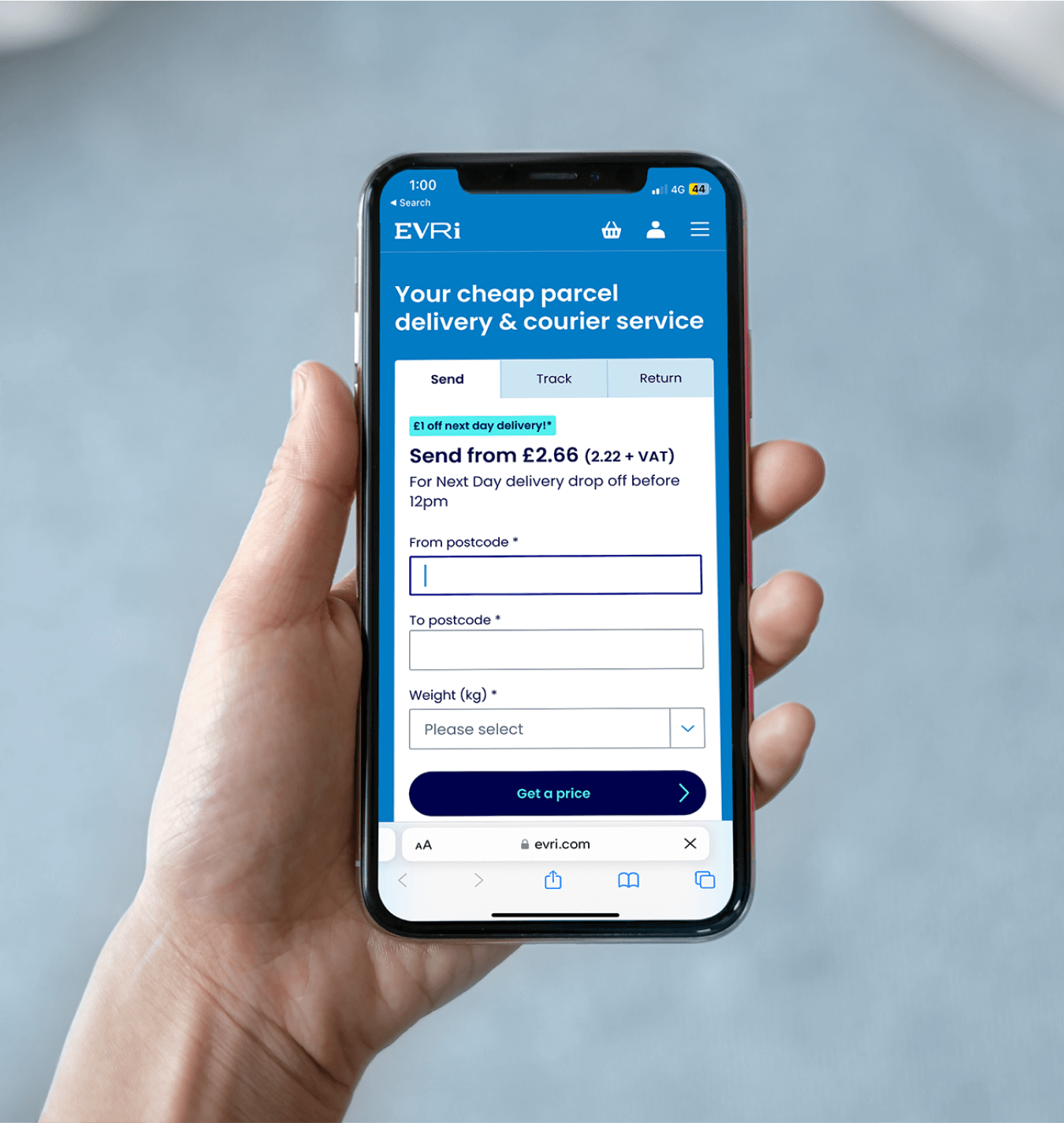
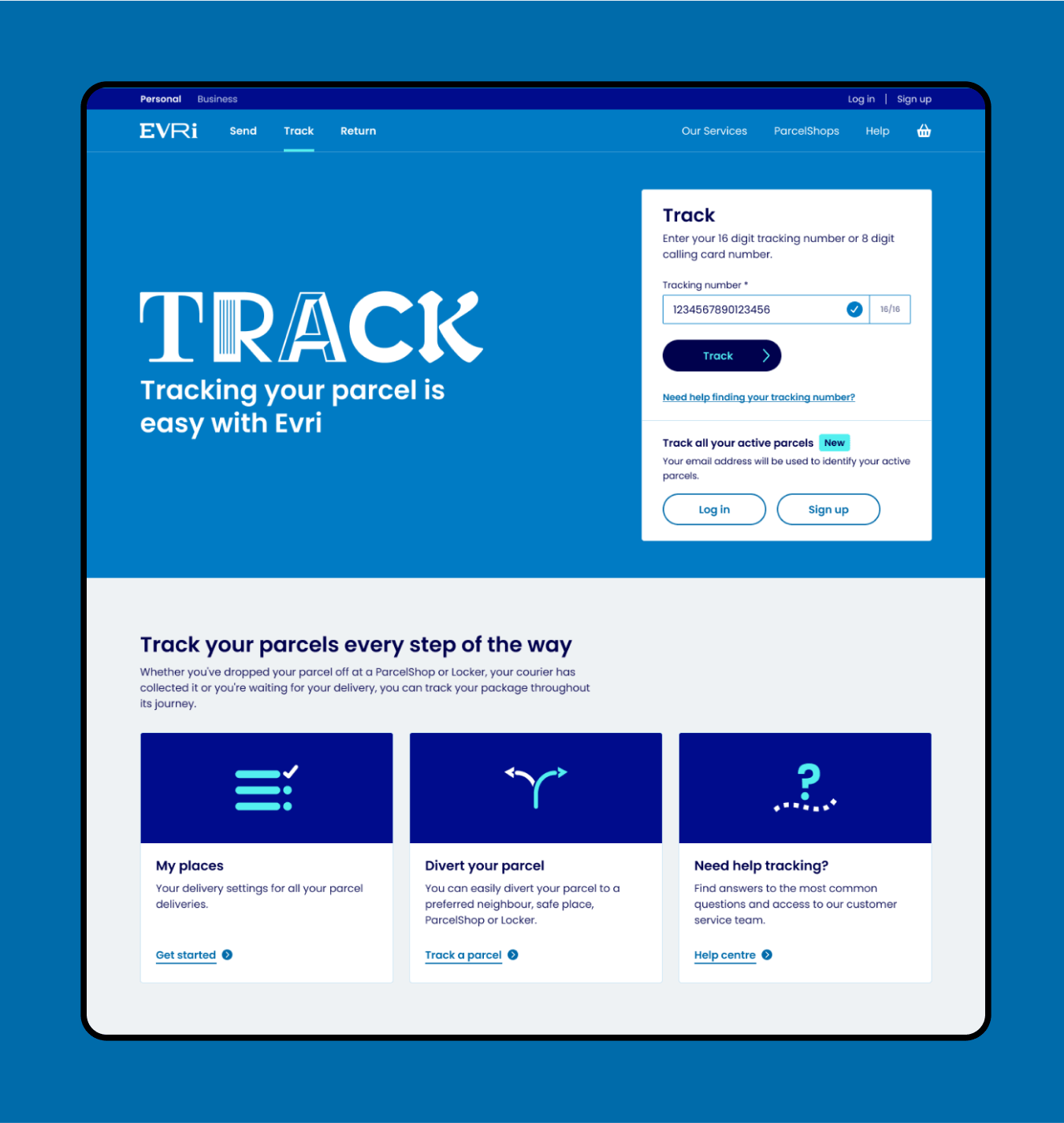
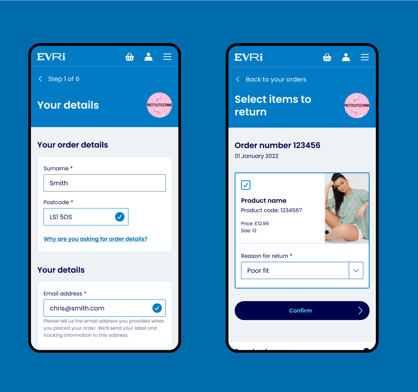
UX, UI design – redesign every digital asset of the business
Launch – supporting the build and launch of the updates
Outcomes
Design to build workflow efficiencies
Quality and consistent UI
Accessibility and usability improvements
Minimising impact on KPIs during rebrand
Set the foundations for continuous improvement
“Tom was incredible to work with on this project. He not only has killer design skills, but is obsessed with creating the best possible outputs and outcomes for clients, and will work relentlessly to achieve it. We definitely would not have been able to deliver such a huge and complex project without him.”
Marius Cloete Head of UX – Evri
1.
Audit and plan
Team collaboration
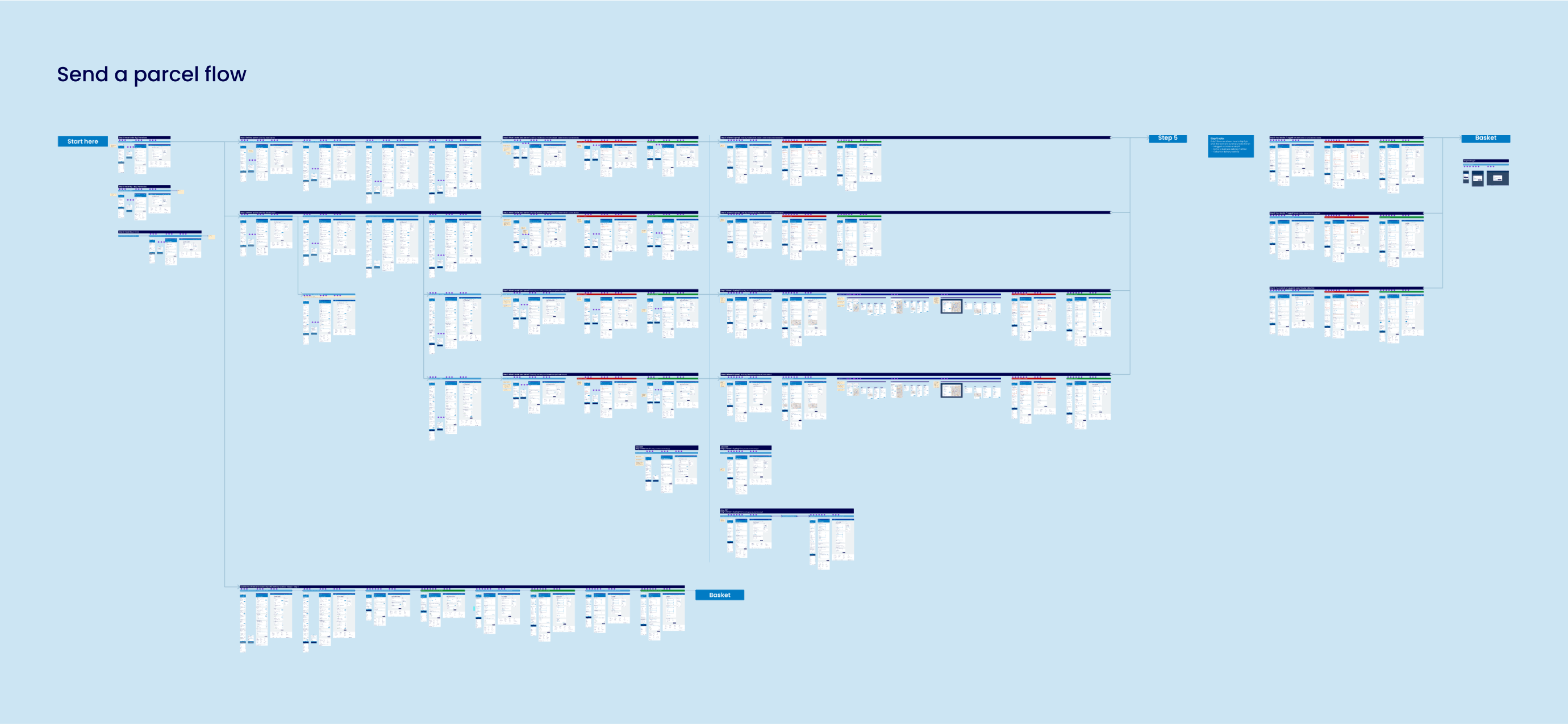
The design team for this project was made up of myself and three other UX/UI designers. We collaborated daily and worked together on almost every part of the project. So, for the purposes of this case study I will refer to ‘we’ because there were not many areas that just one person touched.
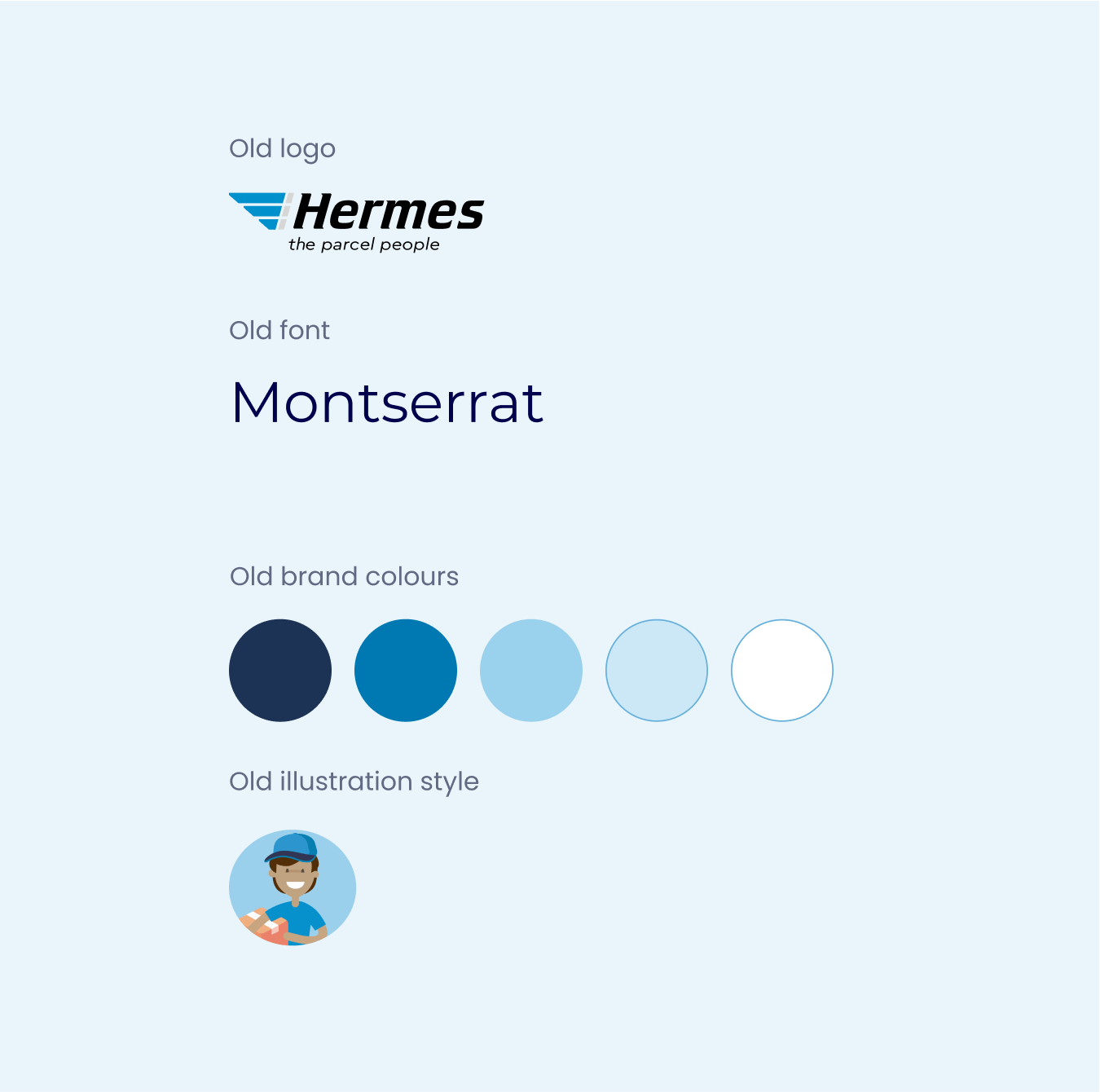
Audit current assets
To start we reviewed the old Hermes design system, website and apps. The old design system was too complicated to use and maintain which led to low adoption by teams and inconsistent implementation.
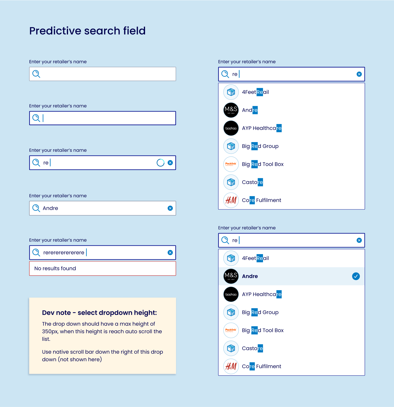
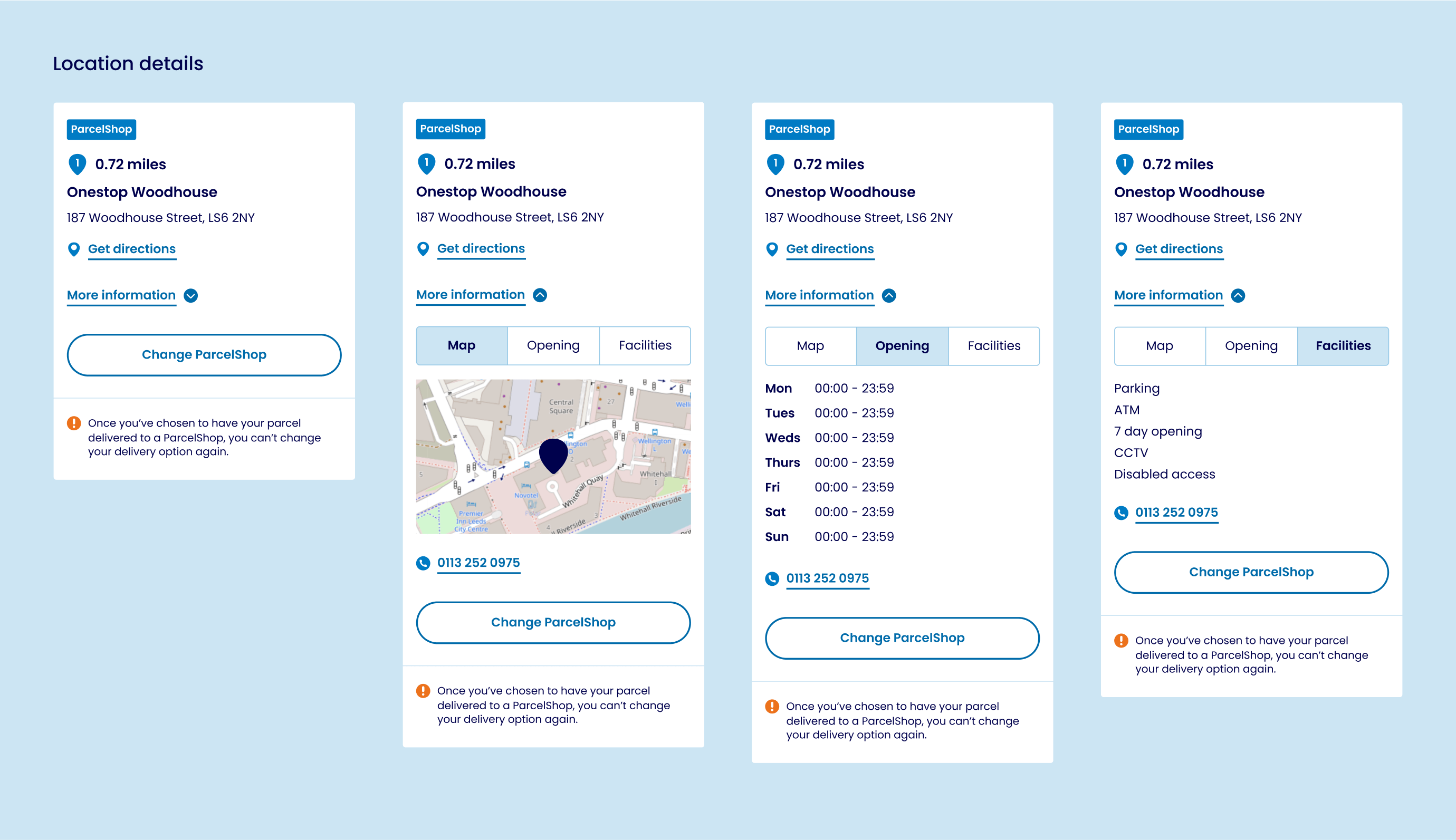
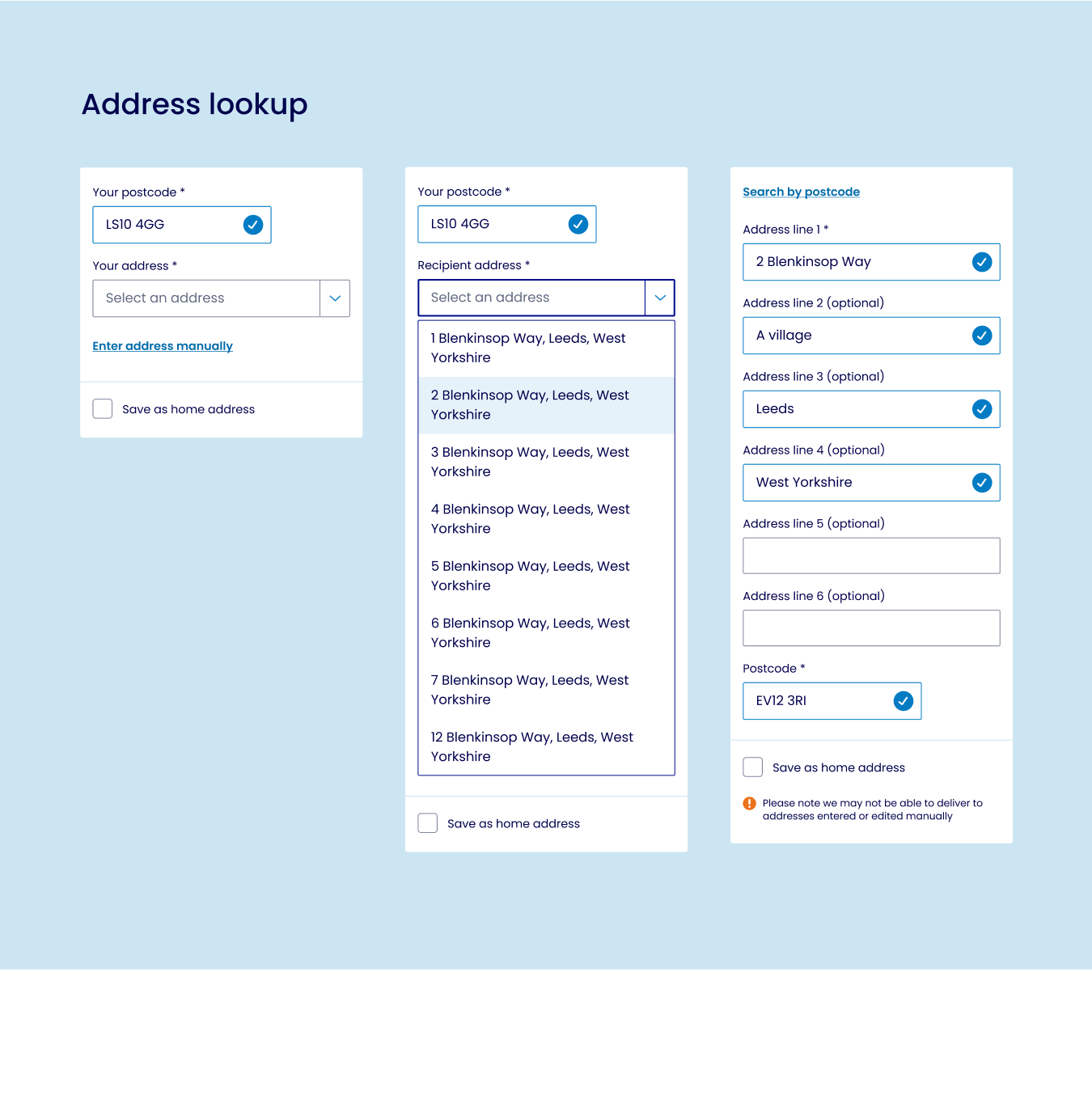
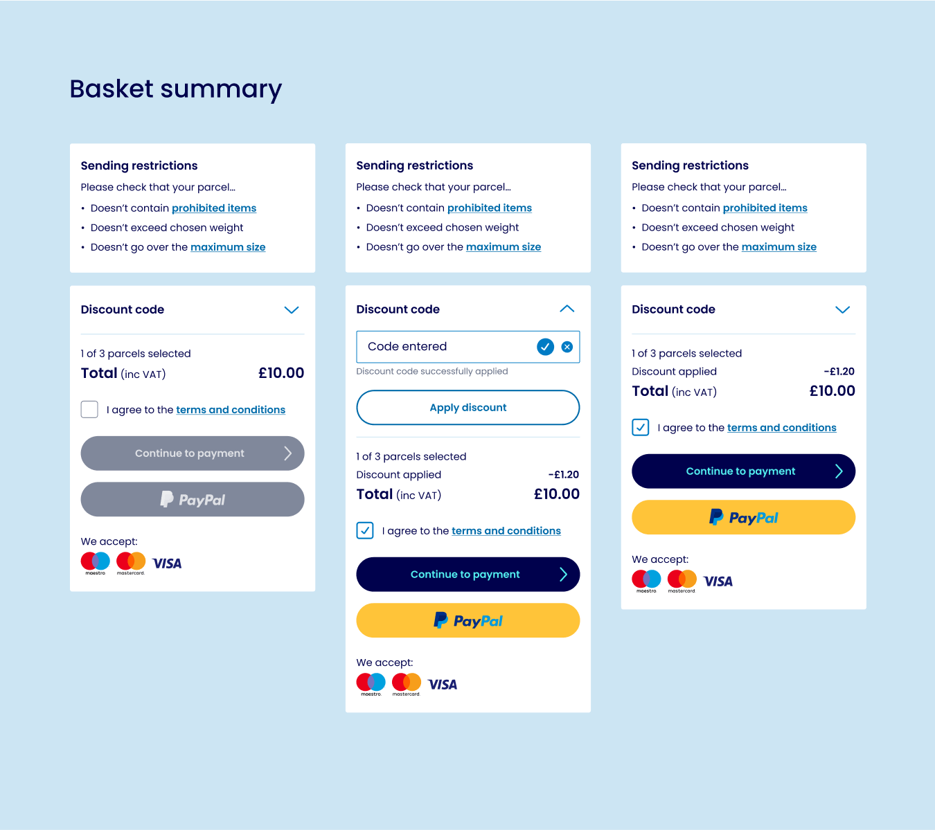
We reviewed components, UI patterns and user journeys to understand the scope of work required to create the new design system, to see what we could simplify, and what usability and accessibility improvements could be made whilst applying the rebrand.
Prioritise
Once the level of work was understood we prioritised what we would work on first and who would work on what. First up we needed to refine the initial supplied brand concepts into a usable digital style guide. This would enable us to define the basics of the design system, unlocking engineers to start building whilst we were fleshing out full UI designs and user journeys.
2.
Digital brand development
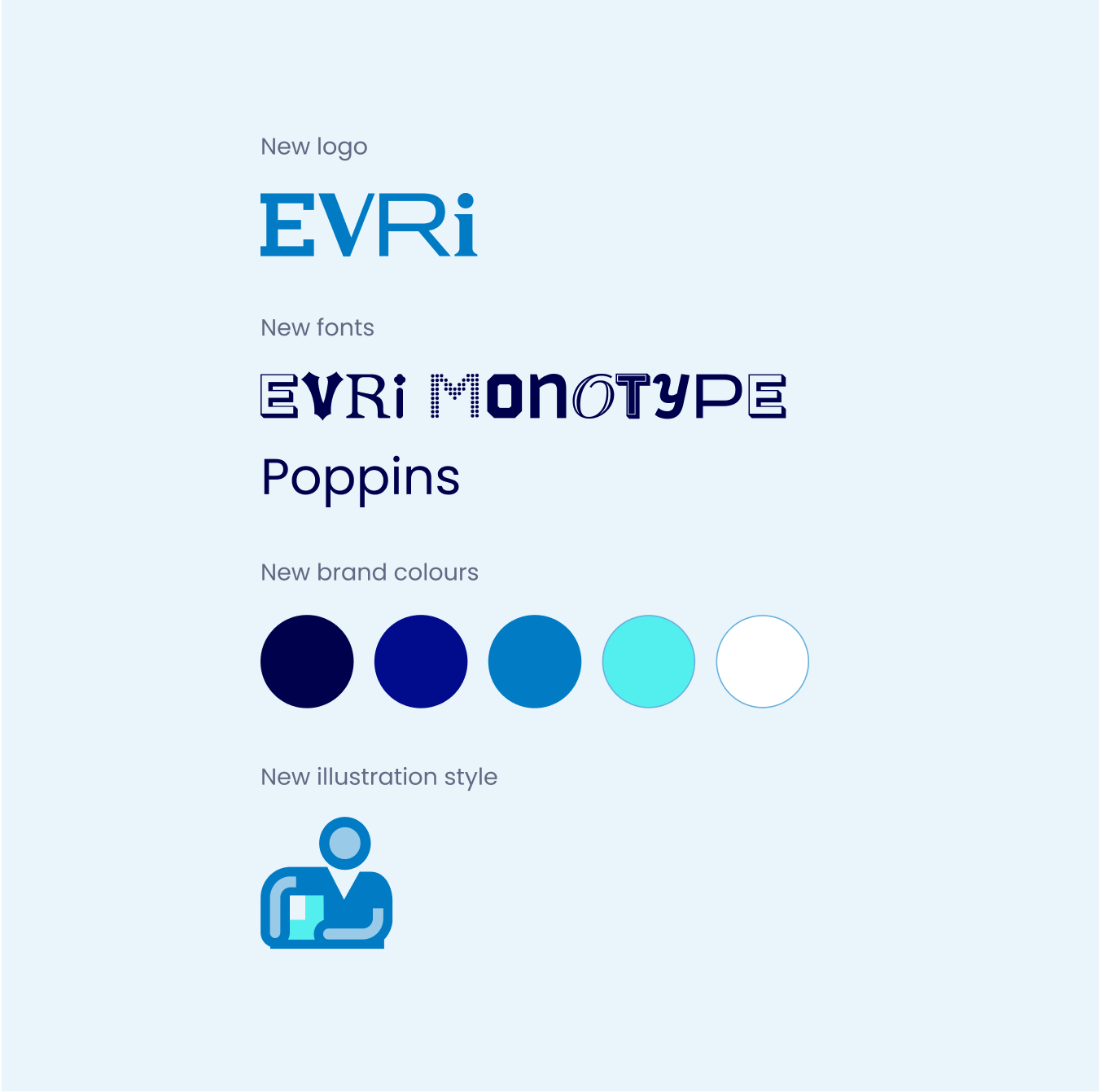
The new brand
We were supplied with the new brand style to apply to digital. The initial vision of the rebrand was to use only two brand colours, and large type based illustrations – no imagery. A custom adaptive heading typeface was created which changes each time you type a character.
We had to push back on the colour palette which was too restrictive to create usable interfaces. We also had to push back on type illustrations – whilst they looked good printed large they did not apply well small scale on digital screens. We needed photography and more detailed illustrations/icons to explain things visually, whilst keeping it easy for the user to understand the meaning.
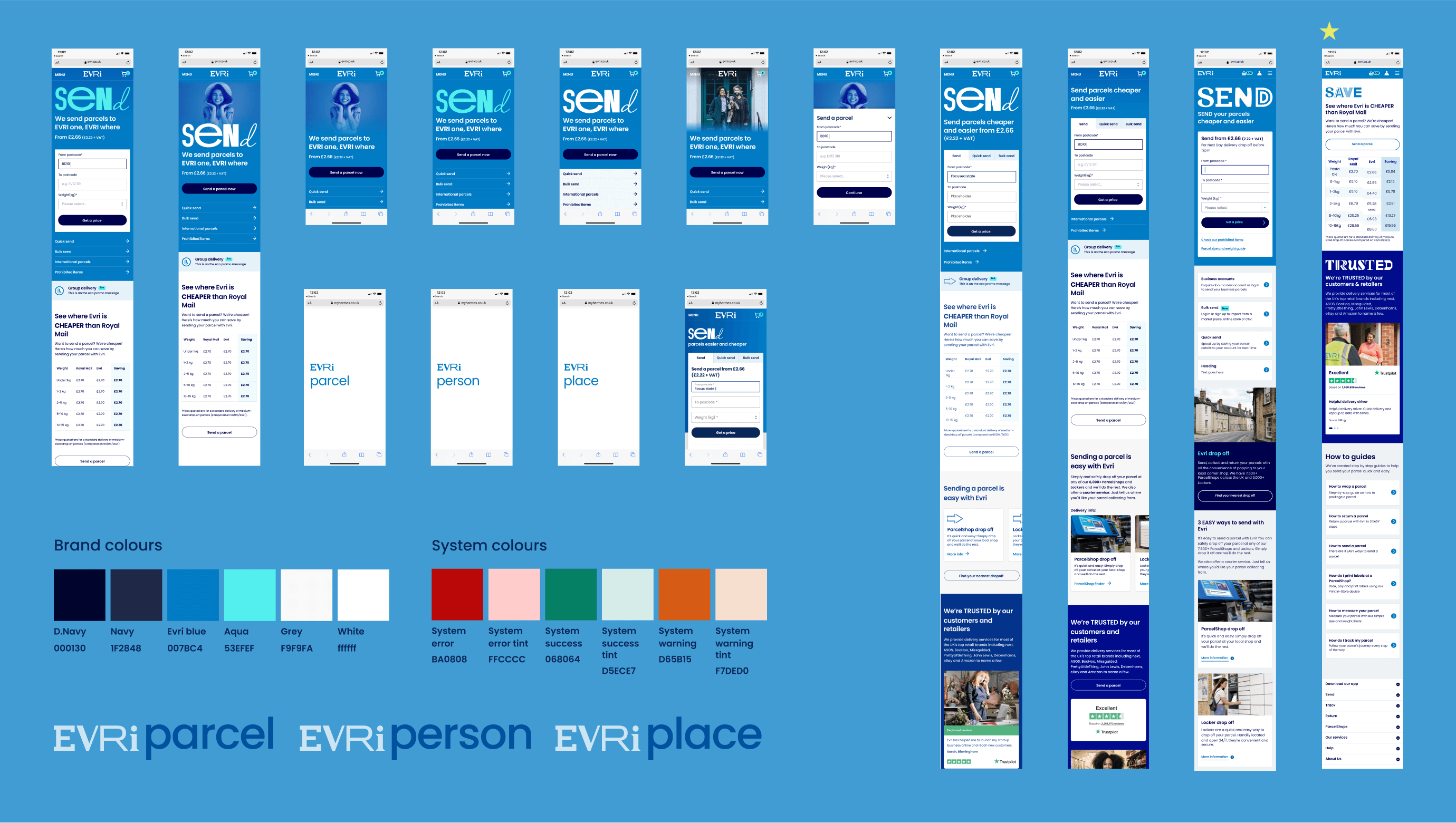
New digital style exploration
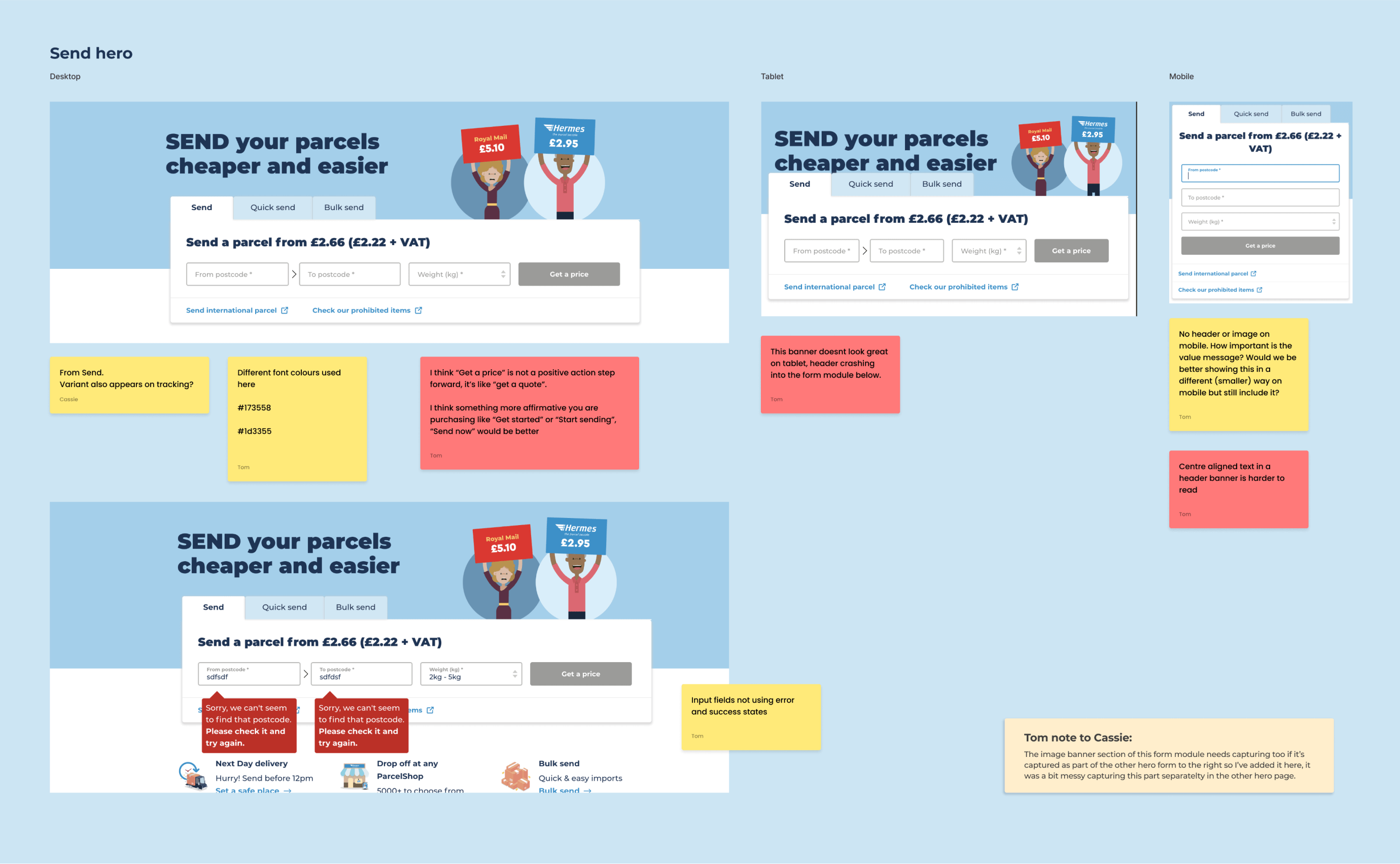
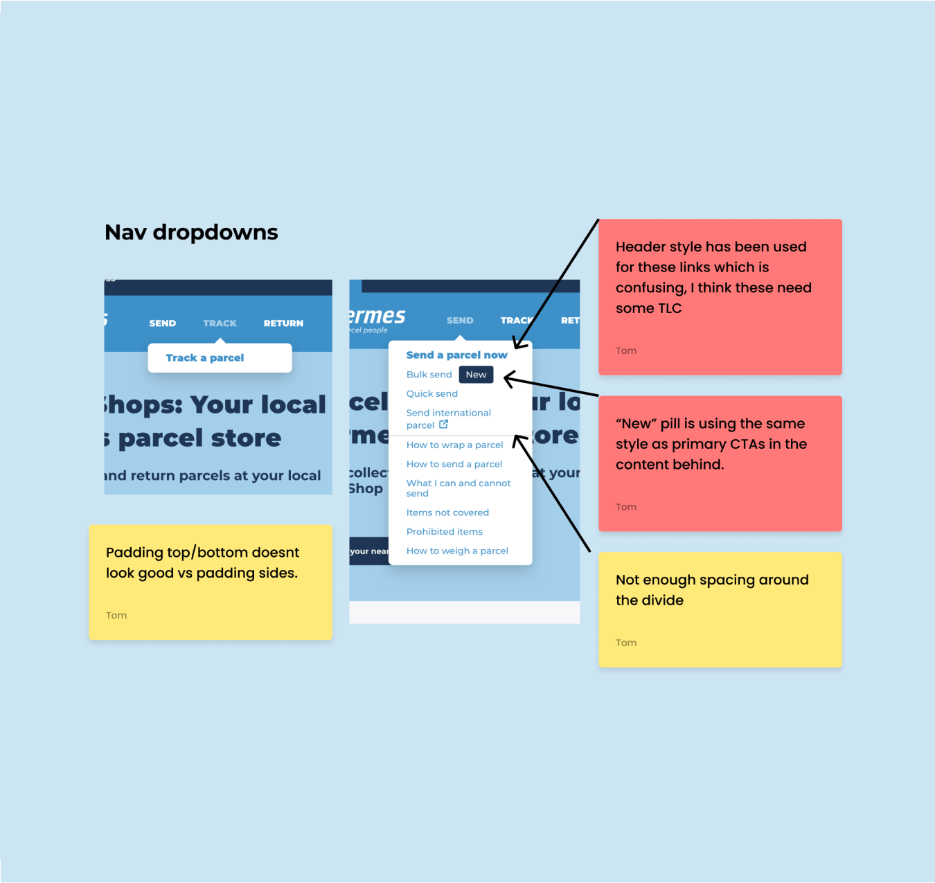
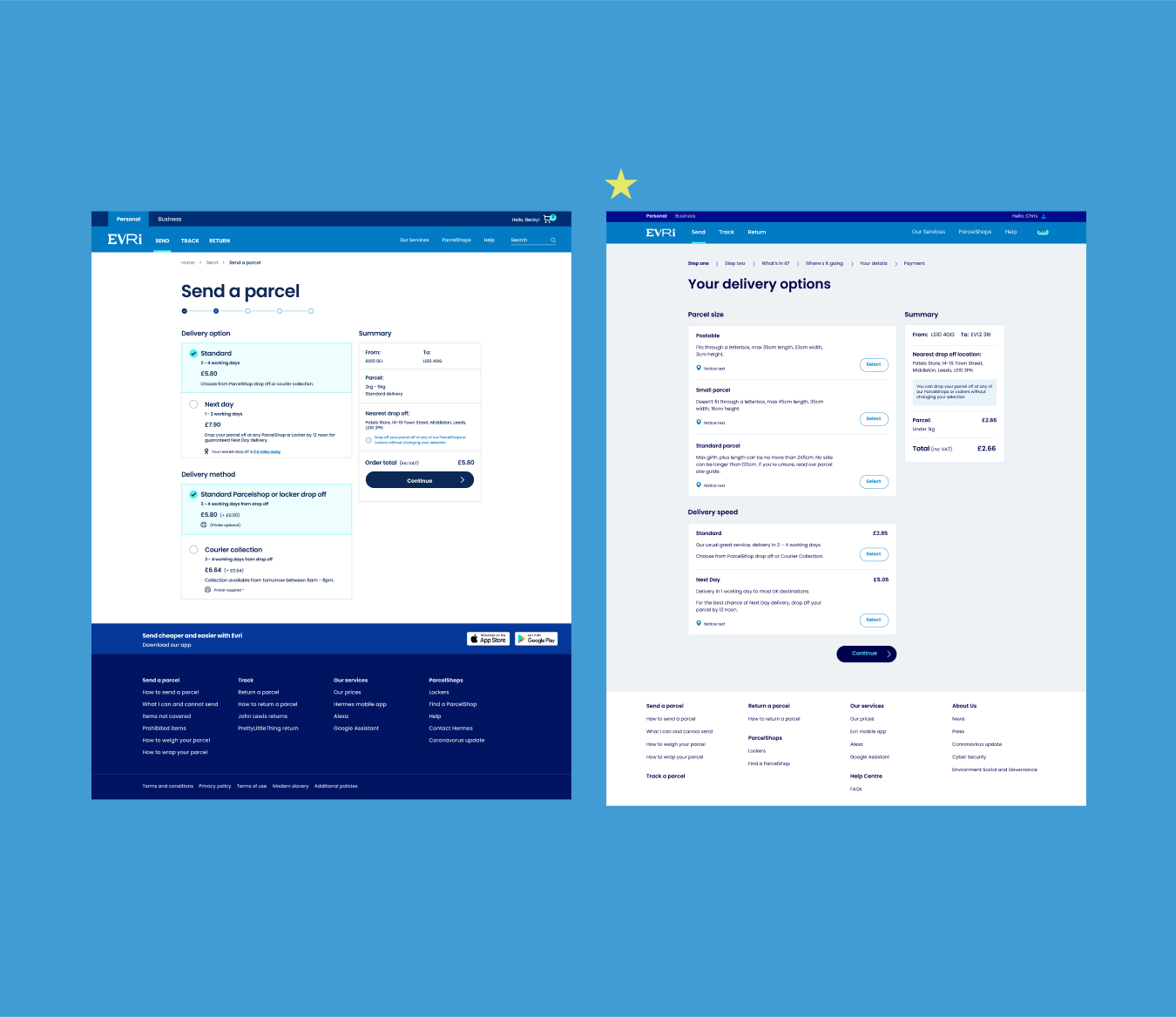
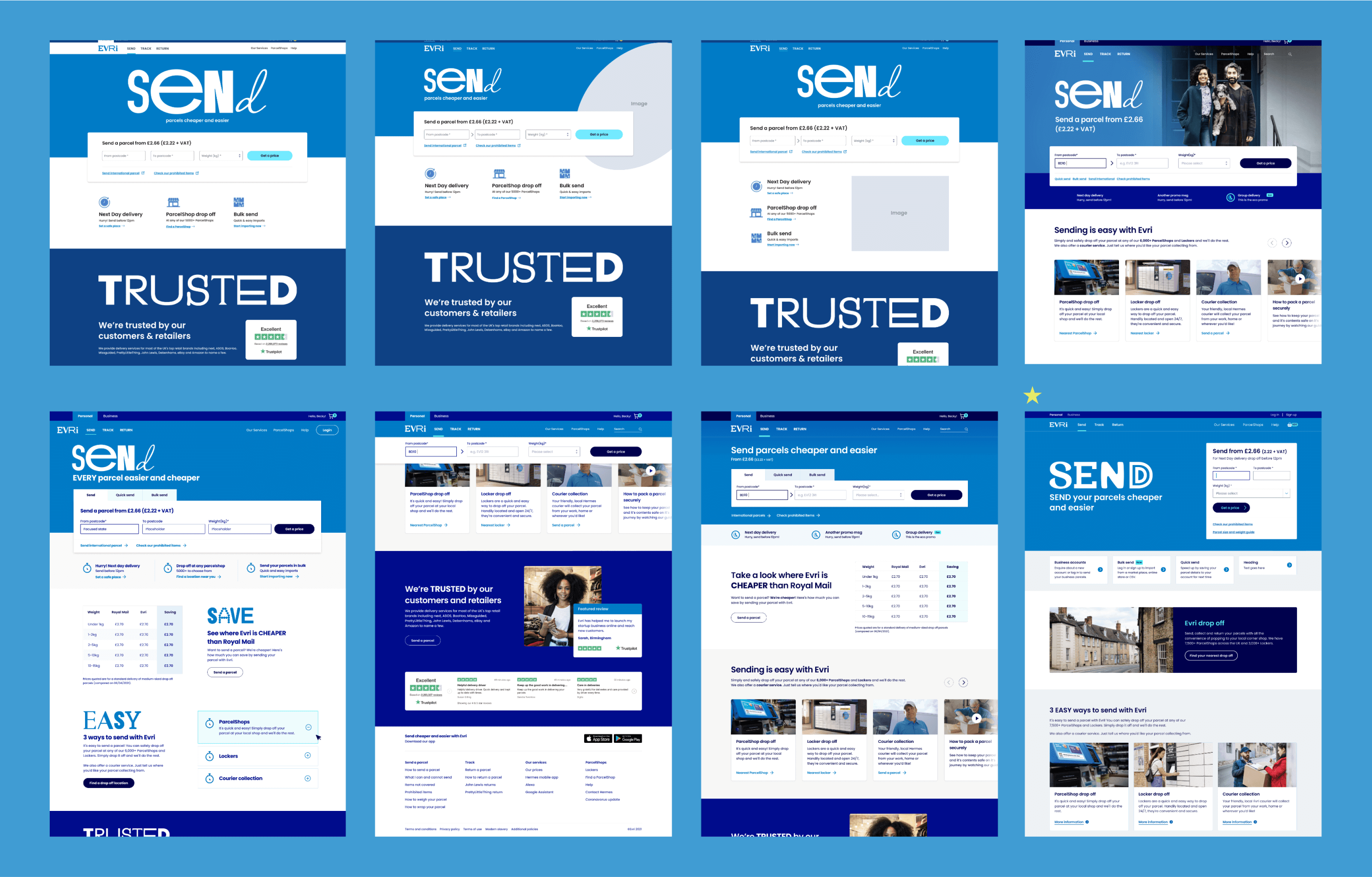
We started as small as possible with a few key screens to explore the new brand style. We needed to identify what worked and what didn’t before making design decisions that would be rolled out to a huge number of screens.
We stress tested existing components and patterns to see which could be re-purposed and which needed to be created from scratch.
This was an intensive collaboration process with the other designers and with regular senior stakeholder presentations for feedback and to align the direction of the digital style.
3.
Design system
Desired outcome
Transition all design to Figma
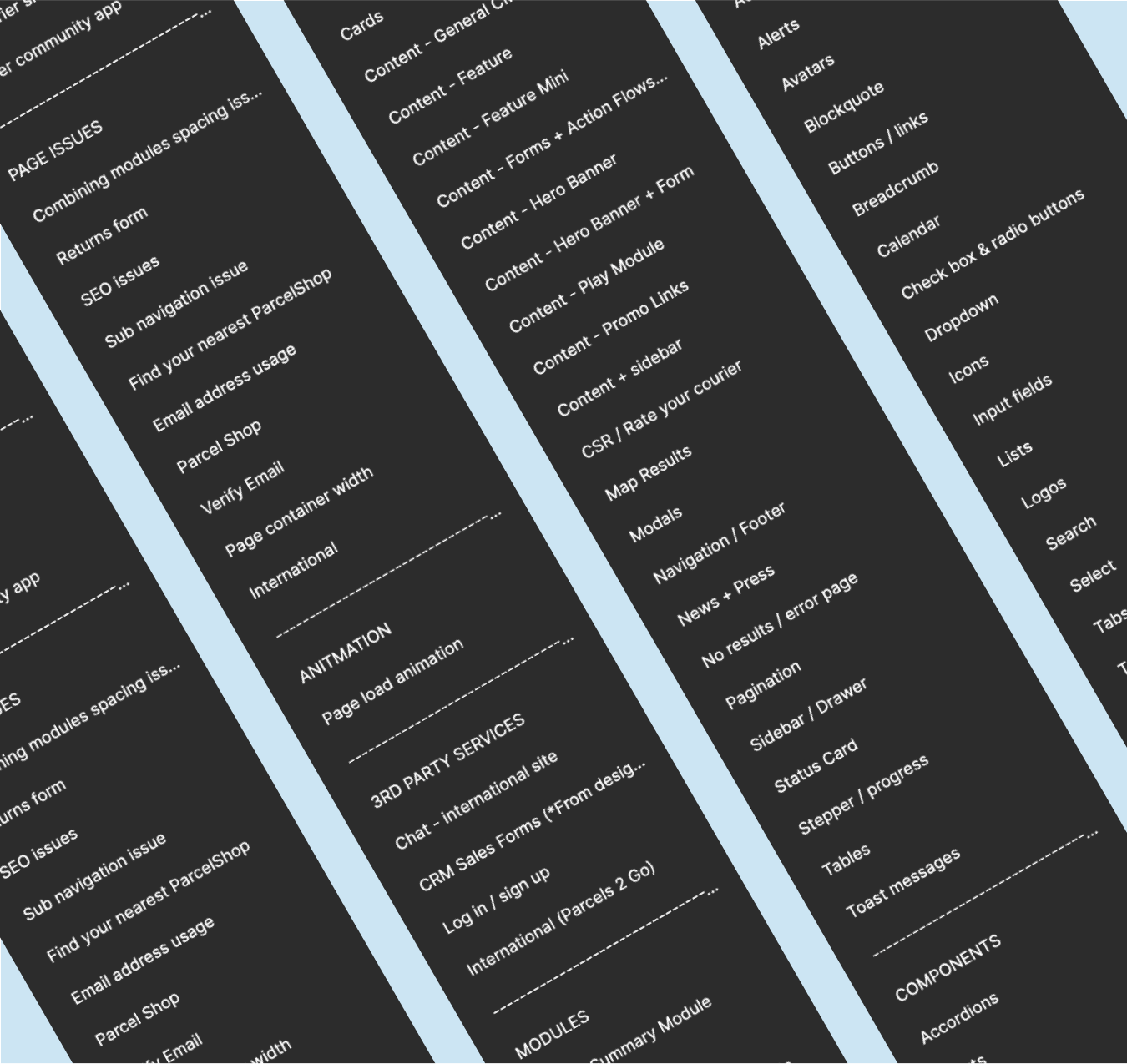
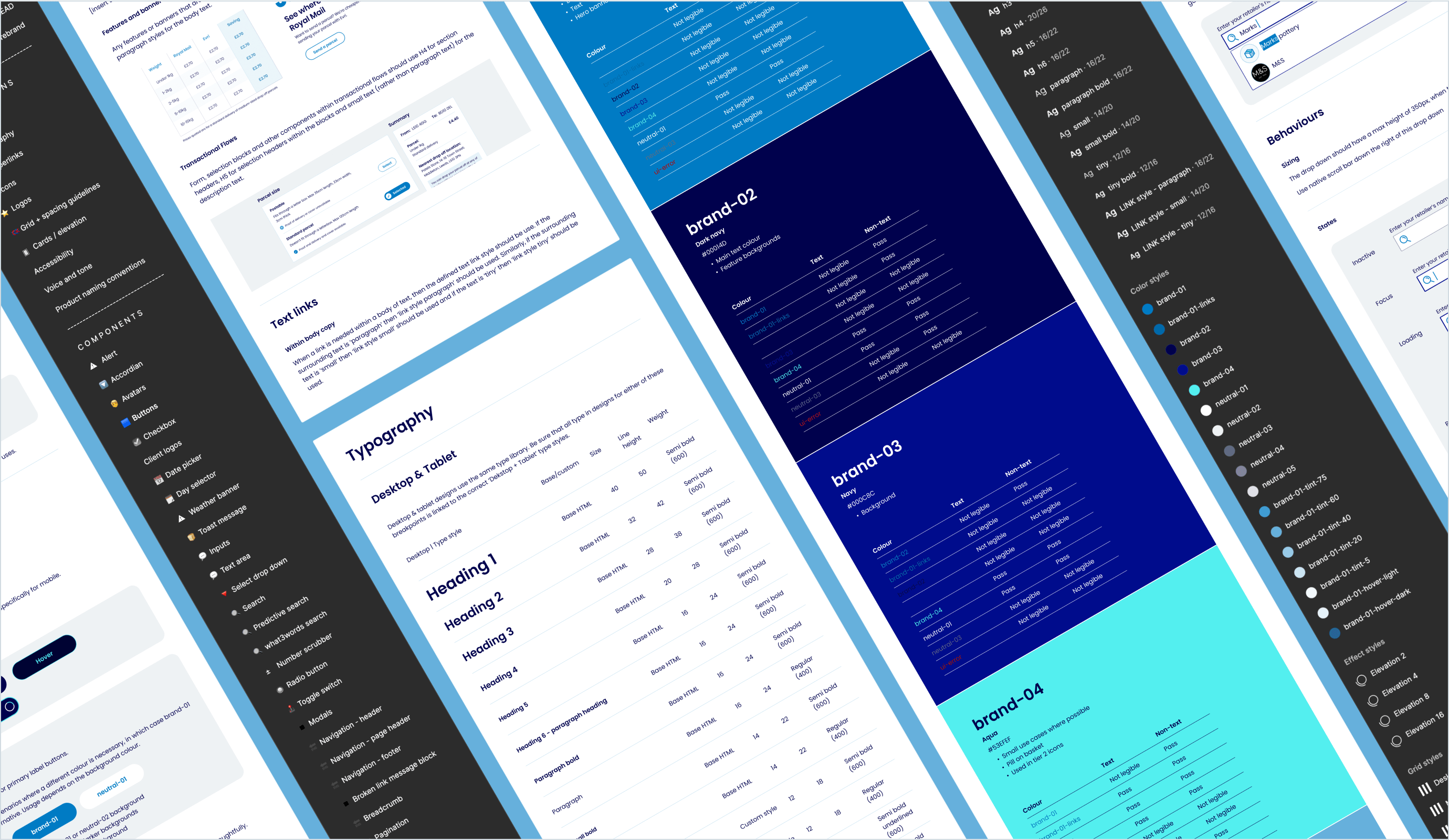
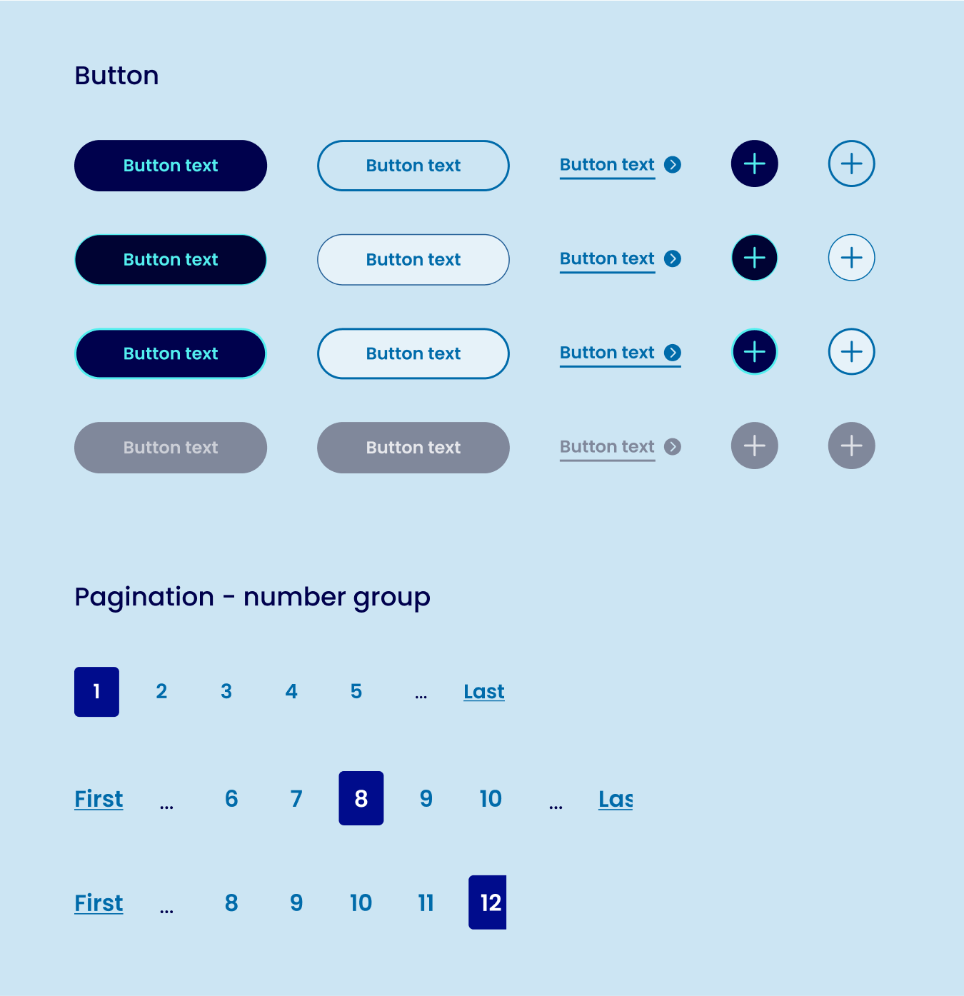
Robust and flexible component library
Improve accessibility
Better documentation
Quicker and easier to consumption
Business-wide adoption
Defining the rules
We used the digital design style to extract and refine; typography, colour palette (WCAG AA standard), sizing, spacing, iconography, page layouts and photography styles.
Documentation
With better documentation we could more quickly onboard designers new to the business or new to Figma, create a better handover experience for developers and allow non designer/technical people to view the system and understand it.
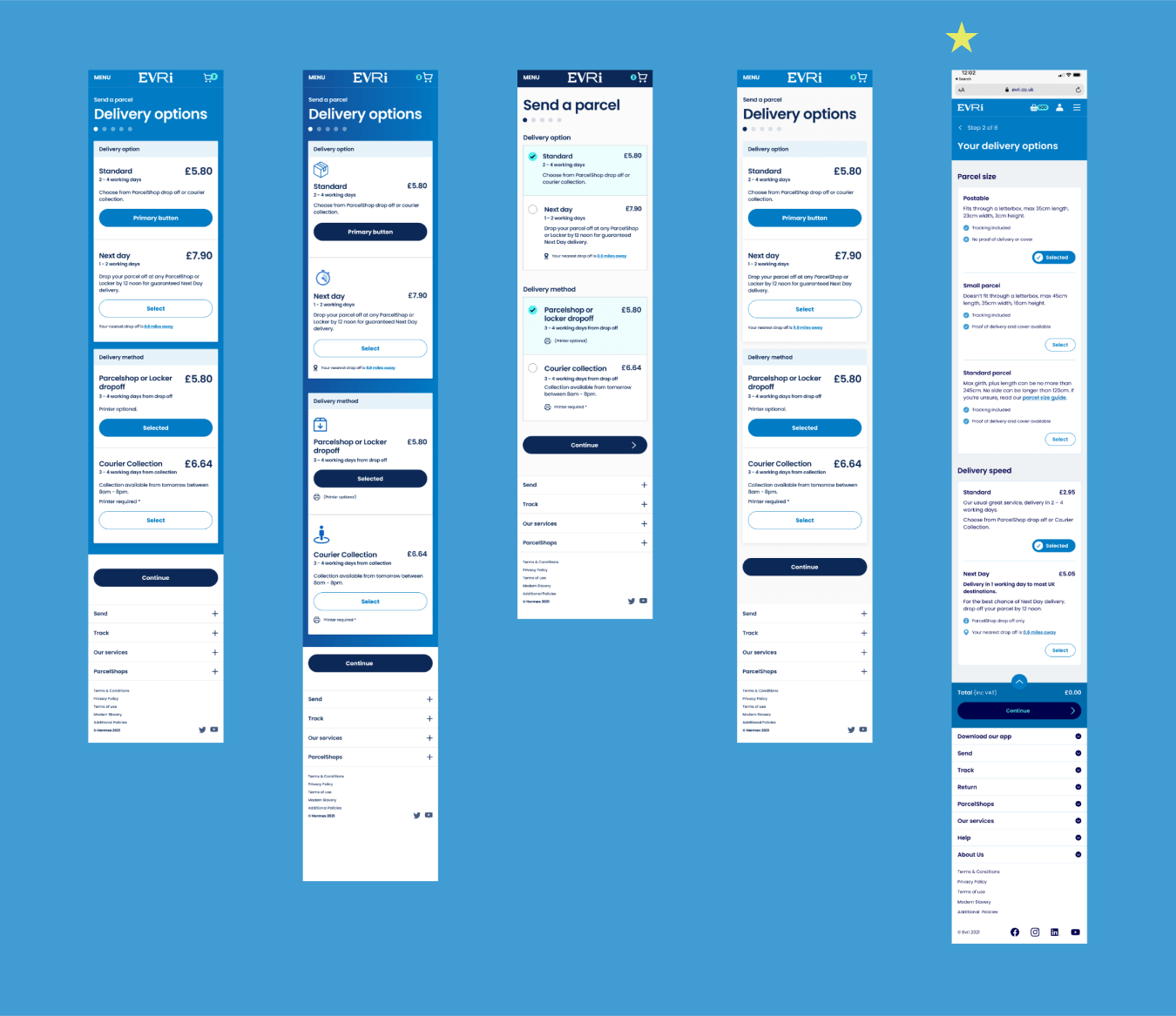
Re-usable UI patterns
We created a UI module library made up of common re-usable groups of components that can be used across multiple interfaces. The benefit of this library made creating complex user flows much quicker – and customers can familiarise themselves with expected behaviours throughout this different touch points.
4.
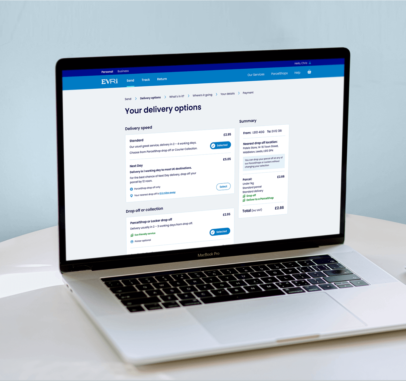
Redesign rollout
What we did
We redesigned every page of the website, apps and digital devices. This involved creating page designs and detailed user flows in Figma. We worked closely with product teams, engineers and testers to deliver the work at a rapid pace – the systematic design process we had created facilitated this.
5.
Launch
Design to dev efficiency
The prior workflow used multiple pieces of software to design, prototype and share with the business; Zeplin, Overflow, Sketch, InVision, Abstract. We transitioned design to just use Figma for creation and collaboration. This massively improved the design and handover to development process.
The component library was built in code and thoroughly tested before rolling out full page builds. Whilst there is an initial spike in the work required to implement this without getting fully built pages in return (quickly), the investment upfront makes huge efficiencies as you move forward in the project.
Supporting the launch
Leading up to the launch I was heavily involved in assisting the engineers and testers, and I think it would be fair to say went above and beyond the expectations of a designer on this one.
The challenges
Initial brand concepts were well prepared for out of home and print format but not for digital. The vision needed fleshing out considerably for digital which took up a lot of the initial phase of the project.
We had to deliver a large volume of work within a relatively small timeframe with small design and core engineering team. This was a lot of pressure for UX designers to deliver libraries and product flows on time so that developers were not held up and waiting to start.
This project was very (VERY) challenging but also very rewarding.